从零开始的Python速切大物实验🏃
读完这个教程,你将学会用python处理简单的数据并将其可视化。本教程的最终目的是解决大物实验中要求的一系列数据处理任务,因此不会讲python语法,是彻底的实用主义,适合从没有用过python的,或者只会一点的,或者想用python处理大物实验的人学习。
数据的导入
excel
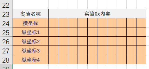
在该文件夹下新建一个xxx.xlsx,把你的报告上的数据输到表格里。下面是一个例子:

记住表格所处的行列位置:在上面的例子中是 23-28行,1-11行。
后续数据处理,将统一按照如下的格式输入数据:
pandas
#将import语句放到文件的最前面
import pandas as pd
pandas是一个python库,可以用它处理excel表格中的数据,将其提取到程序的变量中,还可以修改,添加Excel表格内容。介绍最基本的内容:读取表格。
import xxxx as yy 表示导入 xxxx 库,并将其简记为 yy。下文中出现的 pd.read_excel() 中的 pd 就是 pandas 自定义的缩写。
io = "你的xlsx文件名字.xlsx"
data = pd.read_excel(io, sheet_name=0, header=22, index_col=0)
data_head = data.iloc[0:5, 0:10]
data_values = data_head.values
io 是字符串变量。其记录了表格的名字。
read_excel()是 pandas 的读取excel表格的函数。 sheet_name=0读取了第一个工作表,header=22表示行表头在第23行,index_col=0表示列表头在第1行。
.iloc[a:b, c:d]是对表进行截取。即截取了从行表头往下 a 到 b-1 行,和从列表头往右 c 到 d-1 列的区域。
.values将data_head中的表头去除,只保留数据。现在,data_values是一个 10×5 二维数组,其中data_values[0]是横坐标。
计算
一般来说,我们需要对导入的数组(数据)做一些运算处理,然后再做可视化图表。下面我举了一些在大物实验或者别的实验中常见的,可能会用上的计算方法。
简单的加减乘除对指次幂运算
一般的加减乘除对指次幂,直接符号运算即可,easy。
    #在巨磁电阻效应实验中,需要进行的小计算
    #data即表格获取的数据
    data[0] = data[0] * 4 * 3.1415936 * 0.1 * 24   #单位:微特斯拉
    data[1] = 4 / data[1] #单位:千欧
    data[2] = 4 / data[2]
sympy 解方程组
import sympy
效果跟卡西欧计算器的解方程组作用差不多,还有更花的玩法等你探索。
#电路实验:三阶移向网络180°计算

R, Xc, Ui = sympy.symbols("R, Xc, Ui")
I1, I2, I3 = sympy.symbols("I1, I2, I3")
U0 = sympy.Symbol("U0")

eq1 = I1 * (R - sympy.I * Xc) + I2 * sympy.I * Xc - Ui
eq2 = I2 * (R - 2*sympy.I*Xc) + I1 * sympy.I * Xc + I3 * sympy.I * Xc
eq3 = I3 * (R - 2*sympy.I*Xc) + I2 * sympy.I * Xc
eq4 = U0 - I3 * (-sympy.I) * Xc

s = sympy.solve([eq1, eq2, eq3, eq4], [I1, I2, I3, U0])

print(s)
scipy 最小二乘法
from scipy.stats import linregress

#data即表格获取的数据
slope, intercept, r_value, p_value, std_err = linregress(data[0].astype('float16'), data[3].astype('float16'))
print("斜率:", slope)
print("截距:", intercept)
print("相关系数:", r_value)
print("p值:", p_value)
print("标准误差:", std_err)
def myfunc(x):
    return slope*x+intercept
getmodel=list(map(myfunc,data[0])) #map()返回迭代器中参数运行函数后得到的迭代器
ax.plot(data[0],getmodel,color = "blue",label="$U_1 = $"+str(f'{1000*slope:.3f}')+r"$\times 10^{-3} I_0+$"+str(f'{intercept:.3f}'))
#最后这条语句涉及到 matplotlib可视化、嵌入公式、浮点数截取有效位,需要先import matplotlib。
数据可视化
有请真神—— matplotlib 与 numpy !
先欣赏几个官网的例子
来自网站 Power spectral density (PSD) — Matplotlib 3.8.1 documentation 的设计:
import matplotlib.pyplot as plt
import numpy as np

import matplotlib.mlab as mlab

# Fixing random state for reproducibility
np.random.seed(19680801)

dt = 0.01
t = np.arange(0, 10, dt)
nse = np.random.randn(len(t))
r = np.exp(-t / 0.05)

cnse = np.convolve(nse, r) * dt
cnse = cnse[:len(t)]
s = 0.1 * np.sin(2 * np.pi * t) + cnse

fig, (ax0, ax1) = plt.subplots(2, 1, layout='constrained')
ax0.plot(t, s)
ax0.set_xlabel('Time (s)')
ax0.set_ylabel('Signal')
ax1.psd(s, 512, 1 / dt)

plt.show()

来自网站 Anatomy of a figure — Matplotlib 3.8.1 documentation 的设计:
import matplotlib.pyplot as plt
import numpy as np

from matplotlib.patches import Circle
from matplotlib.patheffects import withStroke
from matplotlib.ticker import AutoMinorLocator, MultipleLocator

royal_blue = [0, 20/256, 82/256]


# make the figure

np.random.seed(19680801)

X = np.linspace(0.5, 3.5, 100)
Y1 = 3+np.cos(X)
Y2 = 1+np.cos(1+X/0.75)/2
Y3 = np.random.uniform(Y1, Y2, len(X))

fig = plt.figure(figsize=(7.5, 7.5))
ax = fig.add_axes([0.2, 0.17, 0.68, 0.7], aspect=1)

ax.xaxis.set_major_locator(MultipleLocator(1.000))
ax.xaxis.set_minor_locator(AutoMinorLocator(4))
ax.yaxis.set_major_locator(MultipleLocator(1.000))
ax.yaxis.set_minor_locator(AutoMinorLocator(4))
ax.xaxis.set_minor_formatter("{x:.2f}")

ax.set_xlim(0, 4)
ax.set_ylim(0, 4)

ax.tick_params(which='major', width=1.0, length=10, labelsize=14)
ax.tick_params(which='minor', width=1.0, length=5, labelsize=10,
               labelcolor='0.25')

ax.grid(linestyle="--", linewidth=0.5, color='.25', zorder=-10)

ax.plot(X, Y1, c='C0', lw=2.5, label="Blue signal", zorder=10)
ax.plot(X, Y2, c='C1', lw=2.5, label="Orange signal")
ax.plot(X[::3], Y3[::3], linewidth=0, markersize=9,
        marker='s', markerfacecolor='none', markeredgecolor='C4',
        markeredgewidth=2.5)

ax.set_title("Anatomy of a figure", fontsize=20, verticalalignment='bottom')
ax.set_xlabel("x Axis label", fontsize=14)
ax.set_ylabel("y Axis label", fontsize=14)
ax.legend(loc="upper right", fontsize=14)


# Annotate the figure

def annotate(x, y, text, code):
    # Circle marker
    c = Circle((x, y), radius=0.15, clip_on=False, zorder=10, linewidth=2.5,
               edgecolor=royal_blue + [0.6], facecolor='none',
               path_effects=[withStroke(linewidth=7, foreground='white')])
    ax.add_artist(c)

    # use path_effects as a background for the texts
    # draw the path_effects and the colored text separately so that the
    # path_effects cannot clip other texts
    for path_effects in [[withStroke(linewidth=7, foreground='white')], []]:
        color = 'white' if path_effects else royal_blue
        ax.text(x, y-0.2, text, zorder=100,
                ha='center', va='top', weight='bold', color=color,
                style='italic', fontfamily='monospace',
                path_effects=path_effects)

        color = 'white' if path_effects else 'black'
        ax.text(x, y-0.33, code, zorder=100,
                ha='center', va='top', weight='normal', color=color,
                fontfamily='monospace', fontsize='medium',
                path_effects=path_effects)


annotate(3.5, -0.13, "Minor tick label", "ax.xaxis.set_minor_formatter")
annotate(-0.03, 1.0, "Major tick", "ax.yaxis.set_major_locator")
annotate(0.00, 3.75, "Minor tick", "ax.yaxis.set_minor_locator")
annotate(-0.15, 3.00, "Major tick label", "ax.yaxis.set_major_formatter")
annotate(1.68, -0.39, "xlabel", "ax.set_xlabel")
annotate(-0.38, 1.67, "ylabel", "ax.set_ylabel")
annotate(1.52, 4.15, "Title", "ax.set_title")
annotate(1.75, 2.80, "Line", "ax.plot")
annotate(2.25, 1.54, "Markers", "ax.scatter")
annotate(3.00, 3.00, "Grid", "ax.grid")
annotate(3.60, 3.58, "Legend", "ax.legend")
annotate(2.5, 0.55, "Axes", "fig.subplots")
annotate(4, 4.5, "Figure", "plt.figure")
annotate(0.65, 0.01, "x Axis", "ax.xaxis")
annotate(0, 0.36, "y Axis", "ax.yaxis")
annotate(4.0, 0.7, "Spine", "ax.spines")

# frame around figure
fig.patch.set(linewidth=4, edgecolor='0.5')
plt.show()

来自网站 The double pendulum problem — Matplotlib 3.8.1 documentation 的设计:
import matplotlib.pyplot as plt
import numpy as np
from numpy import cos, sin

import matplotlib.animation as animation

G = 9.8  # acceleration due to gravity, in m/s^2
L1 = 1.0  # length of pendulum 1 in m
L2 = 1.0  # length of pendulum 2 in m
L = L1 + L2  # maximal length of the combined pendulum
M1 = 1.0  # mass of pendulum 1 in kg
M2 = 1.0  # mass of pendulum 2 in kg
t_stop = 1000  # how many seconds to simulate
history_len = 500  # how many trajectory points to display


def derivs(t, state):
    dydx = np.zeros_like(state)

    dydx[0] = state[1]

    delta = state[2] - state[0]
    den1 = (M1+M2) * L1 - M2 * L1 * cos(delta) * cos(delta)
    dydx[1] = ((M2 * L1 * state[1] * state[1] * sin(delta) * cos(delta)
                + M2 * G * sin(state[2]) * cos(delta)
                + M2 * L2 * state[3] * state[3] * sin(delta)
                - (M1+M2) * G * sin(state[0]))
               / den1)

    dydx[2] = state[3]

    den2 = (L2/L1) * den1
    dydx[3] = ((- M2 * L2 * state[3] * state[3] * sin(delta) * cos(delta)
                + (M1+M2) * G * sin(state[0]) * cos(delta)
                - (M1+M2) * L1 * state[1] * state[1] * sin(delta)
                - (M1+M2) * G * sin(state[2]))
               / den2)

    return dydx

# create a time array from 0..t_stop sampled at 0.02 second steps
dt = 0.01
t = np.arange(0, t_stop, dt)

# th1 and th2 are the initial angles (degrees)
# w10 and w20 are the initial angular velocities (degrees per second)
th1 = 120.0
w1 = 0.0
th2 = -10.0
w2 = 0.0

# initial state
state = np.radians([th1, w1, th2, w2])

# integrate the ODE using Euler's method
y = np.empty((len(t), 4))
y[0] = state
for i in range(1, len(t)):
    y[i] = y[i - 1] + derivs(t[i - 1], y[i - 1]) * dt

# A more accurate estimate could be obtained e.g. using scipy:
#
#   y = scipy.integrate.solve_ivp(derivs, t[[0, -1]], state, t_eval=t).y.T

x1 = L1*sin(y[:, 0])
y1 = -L1*cos(y[:, 0])

x2 = L2*sin(y[:, 2]) + x1
y2 = -L2*cos(y[:, 2]) + y1

fig = plt.figure(figsize=(5, 4))
ax = fig.add_subplot(autoscale_on=False, xlim=(-L, L), ylim=(-L, 1.))
ax.set_aspect('equal')
ax.grid()

line, = ax.plot([], [], 'o-', lw=2)
trace, = ax.plot([], [], '.-', lw=1, ms=2)
time_template = 'time = %.1fs'
time_text = ax.text(0.05, 0.9, '', transform=ax.transAxes)

def animate(i):
    thisx = [0, x1[i], x2[i]]
    thisy = [0, y1[i], y2[i]]

    history_x = x2[:i]
    history_y = y2[:i]

    line.set_data(thisx, thisy)
    trace.set_data(history_x, history_y)
    time_text.set_text(time_template % (i*dt))
    return line, trace, time_text

ani = animation.FuncAnimation(
    fig, animate, len(y), interval=dt*1000, blit=True)
plt.show()

来自网站 3D errorbars — Matplotlib 3.8.1 documentation 的设计:
import matplotlib.pyplot as plt
import numpy as np

ax = plt.figure().add_subplot(projection='3d')

# setting up a parametric curve
t = np.arange(0, 2*np.pi+.1, 0.01)
x, y, z = np.sin(t), np.cos(3*t), np.sin(5*t)

estep = 15
i = np.arange(t.size)
zuplims = (i % estep == 0) & (i // estep % 3 == 0)
zlolims = (i % estep == 0) & (i // estep % 3 == 2)

ax.errorbar(x, y, z, 0.2, zuplims=zuplims, zlolims=zlolims, errorevery=estep)

ax.set_xlabel("X label")
ax.set_ylabel("Y label")
ax.set_zlabel("Z label")

plt.show()

可以将上面的代码复制自己运行一下。
前置准备
#↓ 放在前面 ↓
#-*- coding: utf-8 -*-
import matplotlib.pyplot as plt
import numpy as np

plt.rcParams['font.sans-serif']=['SimHei'] #用来正常显示中文标签
plt.rcParams['axes.unicode_minus']=False #用来正常显示负号

fig=plt.figure(num=1) #生成组图,一个fig是一个组图
ax=fig.add_subplot(221) #ax是fig中的一个图,221表示"2x2组图的第1个",即ax位于四格左上角
#画完第一格内容后,再令 ax=fig.add_subplot(222), ax将切换至第二格,不再影响第一格的图
plot 函数
#plot函数可以在图上生成一个折线图。基本会用plot函数就能搞定大物实验了

ax.plot(data[0],data[1], #xy坐标: 前为x,后为y. 输入的是一组数组
        color='red',#线条颜色, 可以简记为 c='red'或 c='r'
        linestyle='-',#线条样式,'-'为实线, 可以简记为 ls='-'. 不画线为''
        linewidth=0.25,#线宽度,简记为lw
        alpha=1,#点线透明度
        marker='.',#点样式,'.'为实点, 不画点为''
        markersize=0.25,#点大小,简记为ms
        label="图示")
设置xy坐标
ax.set_xlabel("B / T") #设置x轴单位
ax.set_ylabel("R / kΩ") #设置y轴单位
ax.set_xticks(np.linspace(0,6,13))#np.linspace()函数为等差数列,0至6的13个数组成的等差数列.
#上述代码的意思是x轴刻度设置为0.0, 0.5, 1.0, 1.5 ... 5.5, 6.0.
设置坐标轴刻度
参考 Matplotlib:tick_params语法-CSDN博客
在大物实验中我只用了这个
ax.tick_params(direction = "in")
设置网格
ax.grid(True)
ax.grid(ls = '-', lw = 0.25)
设置标题
ax.set_title("图2 验证霍尔电势差与螺线管内磁感应强度成正比")
设置图示
ax.legend(loc=4)#loc=1,2,3,4就是放在图的四个角
#这条语句要放在一个plot都编码完毕后再执行,即放在一个ax里的最后,再ax换下一个图
渲染
plt.show() #放到整个文件的最后
可能用到的
如何在输出的图像中的文字部分写数学公式
只需要把要公式表达的地方用 r"$...$" 包裹起来就行。公式要用latex语法编写。
ax.set_xlabel(r"$α \, / \, \degree$")
ax.set_ylabel(r"$U_0 \, / \, mV$")
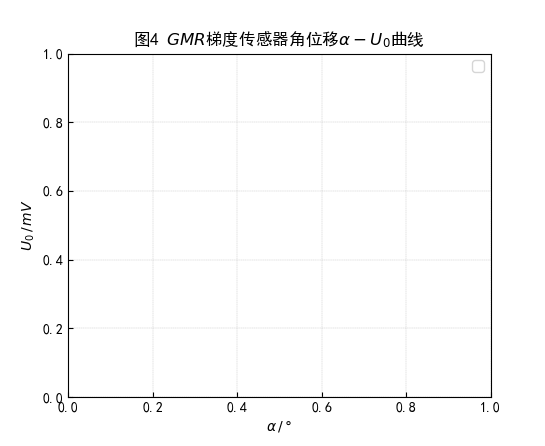
ax.set_title(r"图4 $GMR$梯度传感器角位移$α-U_0$曲线")
浮点数转换为字符串同时保留指定有效数字
str(f'{1000*float_num:.3f}') #保留小数点后三位,再转换为字符串
字符串相加操作
ax.plot(
    data[0],
    getmodel,
    color = "orange",
    label="$U_1 = $"+str(f'{1000*slope:.3f}')+r"$\times 10^{-3} I_0+$"+str(f'{intercept:.3f}')
)
大物实验例子
#-*- coding: utf-8 -*-
import pandas as pd
import matplotlib.pyplot as plt
import numpy as np
import ast
plt.rcParams['font.sans-serif']=['SimHei'] #用来正常显示中文标签
plt.rcParams['axes.unicode_minus']=False #用来正常显示负号
io = "数据记录与处理.xlsx"

def readdata(headerh):
    data = pd.read_excel(io, sheet_name=0, header = headerh, index_col=0)
    data_head = data.head(5)
    data_values = data_head.values
    data_values[1] = (data_values[1]-data_values[2]+data_values[3]-data_values[4])/4
    return data_values
fig=plt.figure(num=1) #figsize=(4,4)
ax=fig.add_subplot(221)
ax.plot(data[0],data[1], ls='--',marker='.',color = "brown")
ax.set_xticks(np.linspace(0,6,13))#np.linspace()函数为等差数列
ax.tick_params(direction = "in")
ax.set_xlabel("Is /mA")
ax.set_ylabel("V /mV")
ax.set_title("图1 测量霍尔电势差与霍尔工作电流的关系")
ax.grid(True)
ax.grid(ls = '--', lw = 0.25)

data = readdata(29)
ax=fig.add_subplot(222)
ax.plot(data[0],data[1], '--.',color = "green")
ax.set_xticks(np.linspace(0,800,9))#np.linspace()函数为等差数列
ax.tick_params(direction = "in")
ax.set_xlabel("Im /mA")
ax.set_ylabel("V /mV")
ax.set_title("图2 验证霍尔电势差与螺线管内磁感应强度成正比")
ax.grid(True)
ax.grid(ls = '-', lw = 0.25)

data = readdata(36)
ax=fig.add_subplot(223)
ax.plot(data[0],data[1], '--.',color = "y")
ax.set_xticks(np.linspace(2,22,11))
ax.tick_params(direction = "in")
ax.set_xlabel("d /cm")
ax.set_ylabel("V /mV")
ax.set_title("图3 研究通电螺线管轴向磁场分布")
ax.grid(True)
ax.grid(ls = '-', lw = 0.25)

data = readdata(43)
ax=fig.add_subplot(224)
ax.plot(data[0],data[1], '--.',color = "purple")
ax.set_xticks(np.linspace(75,0,16))
ax.tick_params(direction = "in")
ax.set_xlabel("d /cm")
ax.set_ylabel("V /mV")
ax.set_title("图4 研究亥姆霍兹线圈径向磁场分布")
ax.grid(True)
ax.grid(ls = '-', lw = 0.25)
plt.show()

#-*- coding: utf-8 -*-

import pandas as pd
import matplotlib.pyplot as plt
import numpy as np
from scipy.stats import linregress
from scipy.optimize import curve_fit

plt.rcParams['font.sans-serif']=['SimHei'] #用来正常显示中文标签
plt.rcParams['axes.unicode_minus']=False #用来正常显示负号

io = "数据记录与处理.xlsx"

def readdata_juci_0(headerh):
    data = pd.read_excel(io, sheet_name=0, header = headerh, index_col=0)
    data_head = data.iloc[0:3, 0:61]
    data_values = data_head.values
    data_values[0] = data_values[0] * 4 * np.pi * 0.1 * 24   #单位:微特斯拉
    data_values[1] = 4 / data_values[1] #单位:千欧
    data_values[2] = 4 / data_values[2]
    return data_values

def readdata_juci_1(headerh):
    data = pd.read_excel(io, sheet_name=0, header = headerh, index_col=0)
    data_head = data.iloc[0:5, 0:11]
    data_values = data_head.values
    print(data_values)
    return data_values

def readdata_juci_2(headerh):
    data = pd.read_excel(io, sheet_name=0, header = headerh, index_col=0)
    data_head = data.iloc[0:3, 0:19]
    data_values = data_head.values
    print(data_values)
    return data_values

def linearrow(x,y,color,step):
    if step > 0:
        for i in range(0,len(x)-1,step):
            ax.annotate("",
                xy=(x[i+1],y[i+1]),
                xytext=(x[i],y[i]),
                # xycoords="figure points",
                arrowprops=dict(arrowstyle="-|>", color=color))
        return
    else:
        for i in range(len(x)-1,0,step):
            ax.annotate("",
            xy=(x[i-1],y[i-1]),
            xytext=(x[i],y[i]),
            # xycoords="figure points",
            arrowprops=dict(arrowstyle="-|>", color=color))
        return
#-------------------------------------------------------------------------------------------#
fig=plt.figure(num=1) #figsize=(4,4)
ax=fig.add_subplot(221)
data = readdata_juci_0(50)
print(data)
ax.plot(data[0],data[1], ls = "-", marker = "x", color = "green",label="电流随横坐标增加而增加")
ax.plot(data[0],data[2], ls = "-", marker = ".",color = "blue",label="电流随横坐标减少而减少")
ax.tick_params(direction = "in")
ax.set_xlabel("$B\,/\mu T$")
ax.set_ylabel("$R\,/k\Omega $")
ax.set_title("图1 $GMR$传感器的$R-B$特征曲线")
ax.grid(True)
ax.grid(ls = '--', lw = 0.25)
ax.legend(loc=1)
#--------------------------------------------------------------------------------------------#
fig=plt.figure(num=1) #figsize=(4,4)
ax=fig.add_subplot(222)
data = readdata_juci_1(55)
print(data)
ax.plot(data[0],data[1], ls = "", marker = "x", color = "green")
ax.plot(data[0],data[2], ls = "", marker = ".",color = "blue")
ax.tick_params(direction = "in")
ax.set_xlabel("$I_0\,/mA$")
ax.set_ylabel("$U_0\,/mV$")
ax.set_title("图2 弱磁偏置状态$I_0-U_0$曲线")
ax.grid(True)
ax.grid(ls = '--', lw = 0.25)
slope, intercept, r_value, p_value, std_err = linregress(data[0].astype('float16'), data[1].astype('float16'))
print("斜率:", slope)
print("截距:", intercept)
print("相关系数:", r_value)
print("p值:", p_value)
print("标准误差:", std_err)
def myfunc(x):
return slope*x+intercept
getmodel=list(map(myfunc,data[0])) #map()返回迭代器中参数运行函数后得到的迭代器
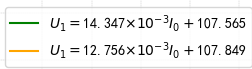
ax.plot(data[0],getmodel,color = "blue",label="$U_1 = $"+str(f'{1000*slope:.3f}')+r"$\times 10^{-3} I_0+$"+str(f'{intercept:.3f}'))
getmodel=list(map(myfunc,data[0])) #map()返回迭代器中参数运行函数后得到的迭代器
ax.plot(data[0]+1,getmodel,color = "green",label="$U_1 = $"+str(f'{1000*slope-0.002:.3f}')+r"$\times 10^{-3} I_0+$"+str(f'{intercept-0.001:.3f}'))
ax.legend(loc=4)
#--------------------------------------------------------------------------------------------#
fig=plt.figure(num=1) #figsize=(4,4)
ax=fig.add_subplot(223)
ax.plot(data[0],data[3], ls = "", marker = ".",color = "lime")
ax.plot(data[0],data[4], ls = "", marker = "x",color = "gold")
ax.tick_params(direction = "in")
ax.set_xlabel("$I_0\,/mA$")
ax.set_ylabel("$U_1\,/mV$")
ax.set_title("图3 强磁偏置状态$I_0-U_1$曲线")
ax.grid(True)
ax.grid(ls = '--', lw = 0.25)
slope, intercept, r_value, p_value, std_err = linregress(data[0].astype('float16'), data[3].astype('float16'))
print("斜率:", slope)
print("截距:", intercept)
print("相关系数:", r_value)
print("p值:", p_value)
print("标准误差:", std_err)
def myfunc(x):
return slope*x+intercept
getmodel=list(map(myfunc,data[0])) #map()返回迭代器中参数运行函数后得到的迭代器
ax.plot(data[0],getmodel,color = "green",label="$U_1 = $"+str(f'{1000*slope:.3f}')+r'$\times 10^{-3} I_0+$'+str(f'{intercept:.3f}'))
linearrow(data[0],getmodel,"green",1)
slope, intercept, r_value, p_value, std_err = linregress(data[0].astype('float16'), data[4].astype('float16'))
print("斜率:", slope)
print("截距:", intercept)
print("相关系数:", r_value)
print("p值:", p_value)
print("标准误差:", std_err)
getmodel=list(map(myfunc,data[0])) #map()返回迭代器中参数运行函数后得到的迭代器
ax.plot(data[0],getmodel,color = "orange")
ax.plot(data[0],getmodel,color = "orange",label="$U_1 = $"+str(f'{1000*slope:.3f}')+r"$\times 10^{-3} I_0+$"+str(f'{intercept:.3f}'))
linearrow(data[0],getmodel,"orange",-1)
ax.legend(loc=4)
#--------------------------------------------------------------------------------------------#
fig=plt.figure(num=1) #figsize=(4,4)
ax=fig.add_subplot(224)
data = readdata_juci_2(62)
print(data)
ax.plot(data[0],data[1], ls = "-", marker = "x", color = "brown",label="正向旋转")
ax.plot(data[0],data[2], ls = "--", marker = ".",color = "plum",label="反向旋转")
ax.tick_params(direction = "in")
ax.set_xlabel(r"$α \,/\,\degree$")
ax.set_ylabel(r"$U_0\,/\,mV$")
ax.set_title(r"图4 $GMR$梯度传感器角位移$α-U_0$曲线")
ax.grid(True)
ax.grid(ls = '--', lw = 0.25)
ax.legend(loc=1)
plt.show()

Comments NOTHING